Bejeca
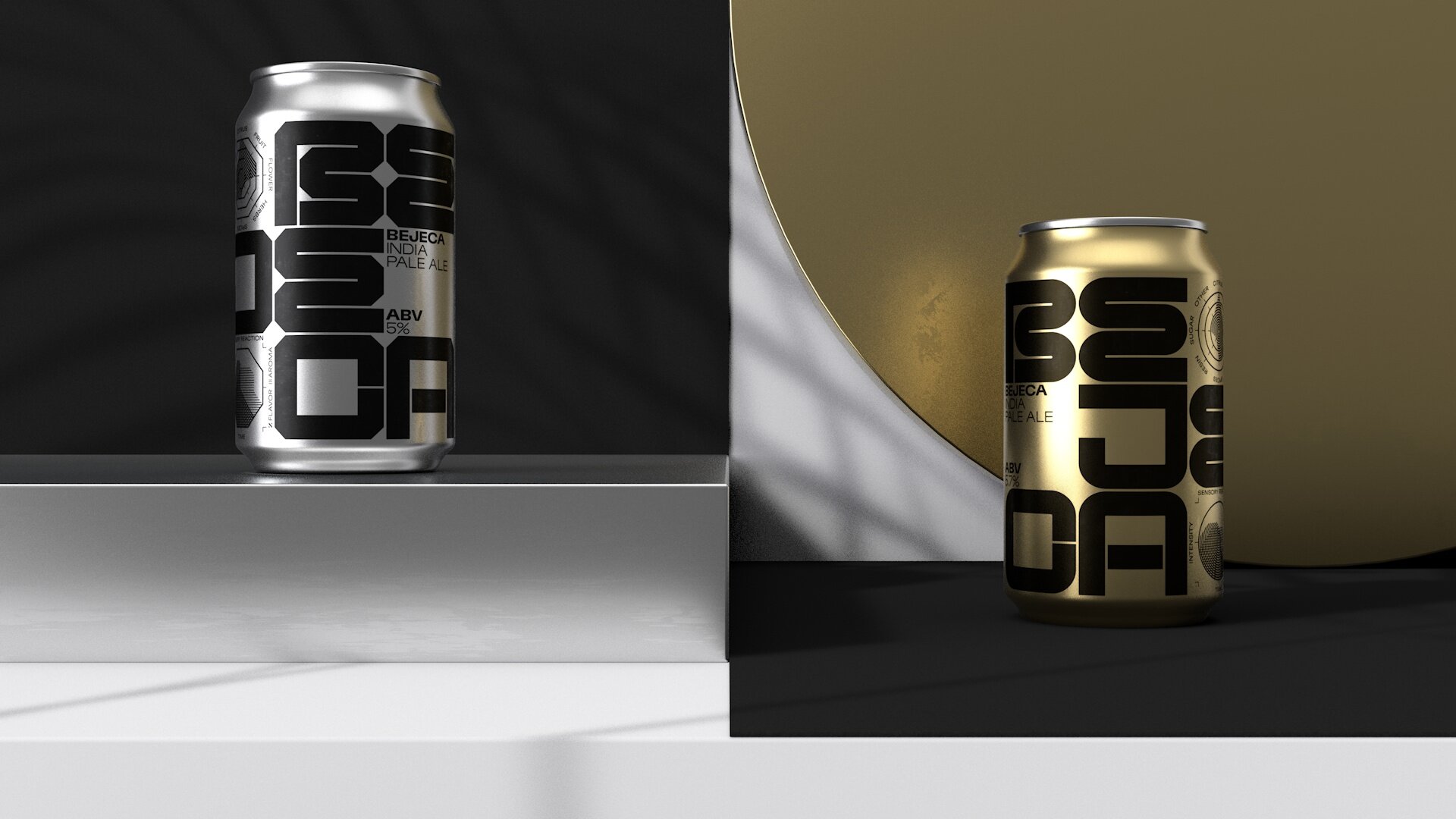
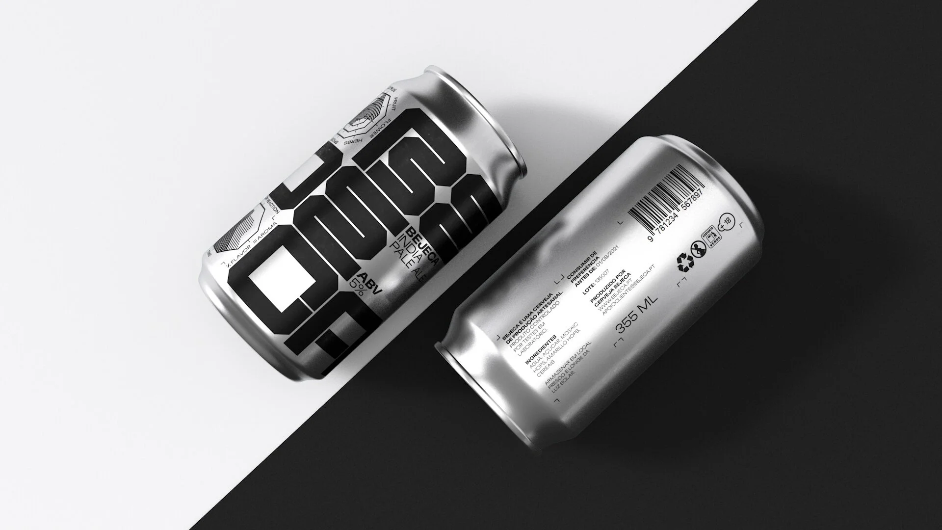
Branding and label design for Bejeca, a micro brewing company focused on crafting beer and educating its customers about the flavor profiles and its nuances. The brand is created from a custom typeface with three variations that change according to the beer profile. The corners and counter spaces of the typeface inform the design of the diagrams that are present on the labels informing the public about the flavor profile of each type of beer as well as the sensory reaction.
Modularity is an integral component of this brand system, allowing the type to shift and be repositioned while maintaining content consistency.
The first production batch is composed of two IPA’s with different complexity levels and distinct characteristics. The distinct character of each beer is communicated not only through the design of the label but also by the color selection.